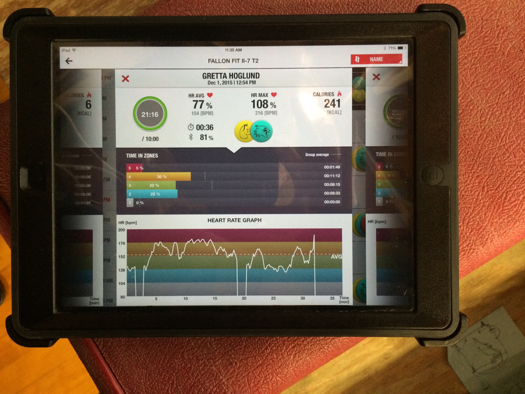
As you can see my graph clearly shows that I am working in a muscular training workout. Where the graph dips down is probably where I warmed up or got a drink of water or stopped what I was doing for a moment. DeLon going up-and-down shows that I am going into my target heart rate zone and then slowing down and then going back into my zone. Where the line is not at the same height as the rest is where I was doing a less strenuous work out and clearly didn't push myself hard enough. Overall this graph shows my weight dedication towards my muscular trading and how my work outs are shown.
 RSS Feed
